Backlit displays are becoming more and more popular thanks to their excellent value. These eye catching back walls are more portable and cost effective than ever. These new panels are easy to assemble and offer a great return on investment (ROI).
Regardless of the display style you choose, designing for an illuminated graphic offers unique opportunities and challenges. This quick post touches on three important points to help make your backlit graphic design look better and ultimately be more successful.
3 Quick Tips For Your Backlit Graphic Design
- All colors change a little when they are backlit
- Try to avoid “fringe colors”
- Contrast is king
Learn more about each of these in this quick post so you can avoid making design errors and create the design you are envisioning.
1. All Colors Change A Little When They are Backlit
When you think about this, it makes sense that colors could appear a little lighter or more vibrant when they have concentrated light behind them. Darker colors like black can appear more grey or blue depending on the location and warmth of the LEDs. Whereas a very faint design could appear washed out and almost not backlit at all. Some print teams and display shops will not offer color matching options for backlit graphics because it can be very hard to guarantee a specific color once its backlit.
Vibrant colors work best as the illumination boosts their natural vibrancy but you still have to use them correctly. We recommend using these colors to contrast other colors and key elements for your design.
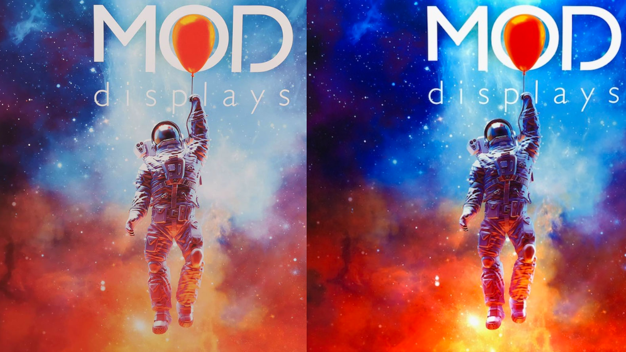
Acknowledging that colors will appear a little different with LEDs behind them compared to a standard exhibit or digital file is important when creating the right expectation and a successful booth design. This helps you adjust your design and color selections accordingly so the final product properly represents your branding.
2. Try To Avoid “Fringe Colors”
We talk about “Fringe Colors” in our Simple Terms: Pantone, CMYK, and More post but essentially these are colors that are on the fringe of another color.
Some examples of a fringe color would be a red with a noticeable orange presence or maybe a strong pink mix. Other examples would be a blue with a noticeable green hue or a yellow with an orange tone. You have to think about how the colors in your design are built and how they may shift when they are illuminated.
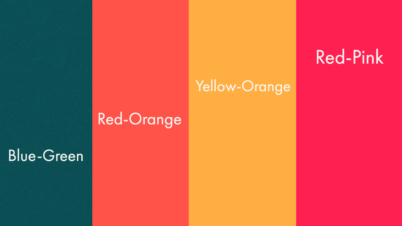
When printing a backlit graphic, you want to avoid fringe colors if that specific color must be exact. The reason to stay away from these is that the color may look perfect when printed on a graphic, brochure, t-shirt, or digital file but when the LEDs turn on, the secondary color may become more visible. When the secondary color shows through, the entire color profile can change.
If your design can tolerate a slight color shift, these colors are fine to use and can often add a lively feel to the design. On the other hand, if you are using these types of colors as a main and exact design element, you may want to rethink the design layout.
3. Contrast Is King
It's worth saying again. Contrast is king!
Contrast always helps to grab attention but it’s amplified even more with a backlit graphic.
When you're creating your design layout, consider ways that you can include dark colors and dark tones next to light colors and light tones. When you turn on the LED backlighting, the color difference will be exaggerated, creating a clean and modern look.
The more contrast between the colors, the greater the visual impact will be. You can also use different tones of the same color to build contrast while adding an interesting dynamic to your design.

With any design work you have to consider how colors will play off one another but with backlit designs, it’s even more important. Adding in contrast to your backlit trade show display design will only help your booth stand out at your events.
First Bonus Tip
Use Your Design, Not Text, To Highlight A Specific Section (or two)
Another trick for your backlit trade show booth design is to create your layout with key sections being highlighted and focus on using visuals to convey your message instead of relying on text.
Again, backlit displays offer a unique opportunity to really use contrast to your benefit. If you are looking to highlight a certain product or feature, design the section where you show this product or feature in contrast with the rest of the display.
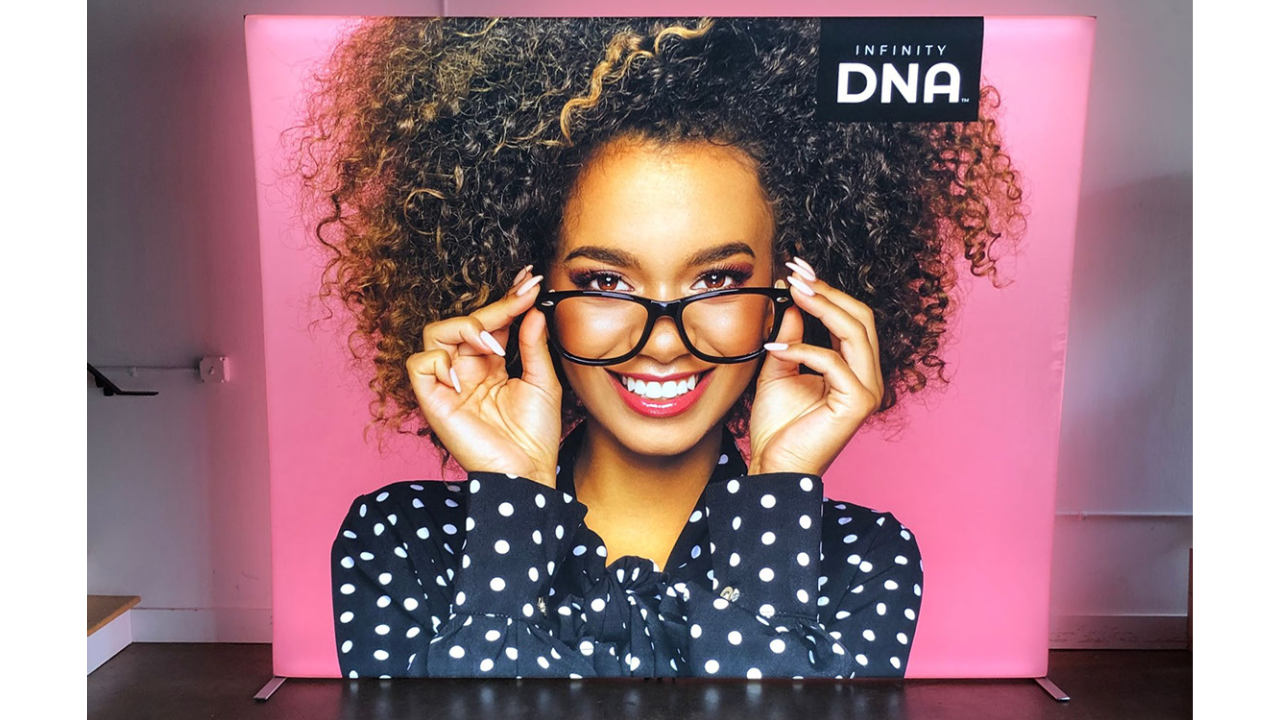
This technique works like a spotlight for your main mes
sage and helps you keep your design focused without becoming text heavy.
Second Bonus Tip
Don't Be Afraid To Use Multipole Displays To Create Your Booth
Any easy way to gain contrast and add value to your purchase is to use more than one panel in your booth. These can be different sized panels or even multipole of the same panels, it doesn't matter.
When designing a backlit booth with multipole panels, it's a smart idea to use the entirety of each panel to showcase one thing per panel. When the panels are aligned together, you are showcasing multipole products, services, brands, etc. in a clear way and since each panel is different, the contrast is creating a visually interesting backlit display. As an added bonus, you can also breakdown this display, depending on the initial size, into smaller booth layouts or even individual panels for business events.

At MODdisplays, we carry numerous types of backlit displays, towers, and counters. We also have a full in-house graphic design team that are familiar with designing backlit trade show booths. Our design services are a flat fee for your entire order so you never overpay by the hour. If you have any questions about your backlit design, please feel free to contact us at info@moddisplays.com or 877.663.3976.


.jpg)

.png)

.avif)


